

14er App Redesign
Concept
Summer is in full swing and you want to go hike one of Colorado’s incredible 14,000ft peaks. You search and find the only large hub of info is 14ers.com. The site has great information but is clunky, a-rhythmic, and possess an outdated aesthetic.
This project looked to fix these issues while seeing what further UX changes could be made to improve overall usability.
Role
Graphic Designer, UX and UI Design, User Research
Duration
3 Week Sprint

Background
Every year tens of thousand of Coloradans venture into the alpine to climb one of the 58 peaks above 14,000 ft. Known as 14ers, these peaks bring unique challenges, both physical and logistical. Planning is key for such activities and many have turned to the internet for help.
How might you create a fun, simple, and trustworthy way for hikers to learn all they need before climbing a 14er?

Current Issues
The current industry leader in this exchange of outdoor information is 14ers.com. Although the site contains a plethora of information, its clunky UX and unappealing UI could be refreshed. Needed information is scattered with no through-line for navigation.
Proposed Changes
Rebrand platform identity
Create a step by step flow to help guide users through the trip planning experience.
Raise the presence of the “My Peaks” feature to compete with other rising outdoor social networks.


User Research
User Interviews
Several user interviews were conducted to determine what features were desired. Highlighted questions:
What do you do before beginning a trip?
What is important for you to know before beginning a trip?
What items do you bring with you on a trip?
Do you camp at the trailhead or drive up the day of?
U.S. Census data was also used to generate accurate content.
Actionable Insights
Individuals would not pay for a premium service.
Trailhead camping information is incredibly important.
The trail itself is less important than logistics of getting to the trailhead.
User Needs
Easy access to information about road conditions, camping regulations, and trail difficulty.
A clean UI that did not distract from the necessary information.


Modern UI Makeover + Gamified Planning Flow + Terminology Explanations
=

Ideation
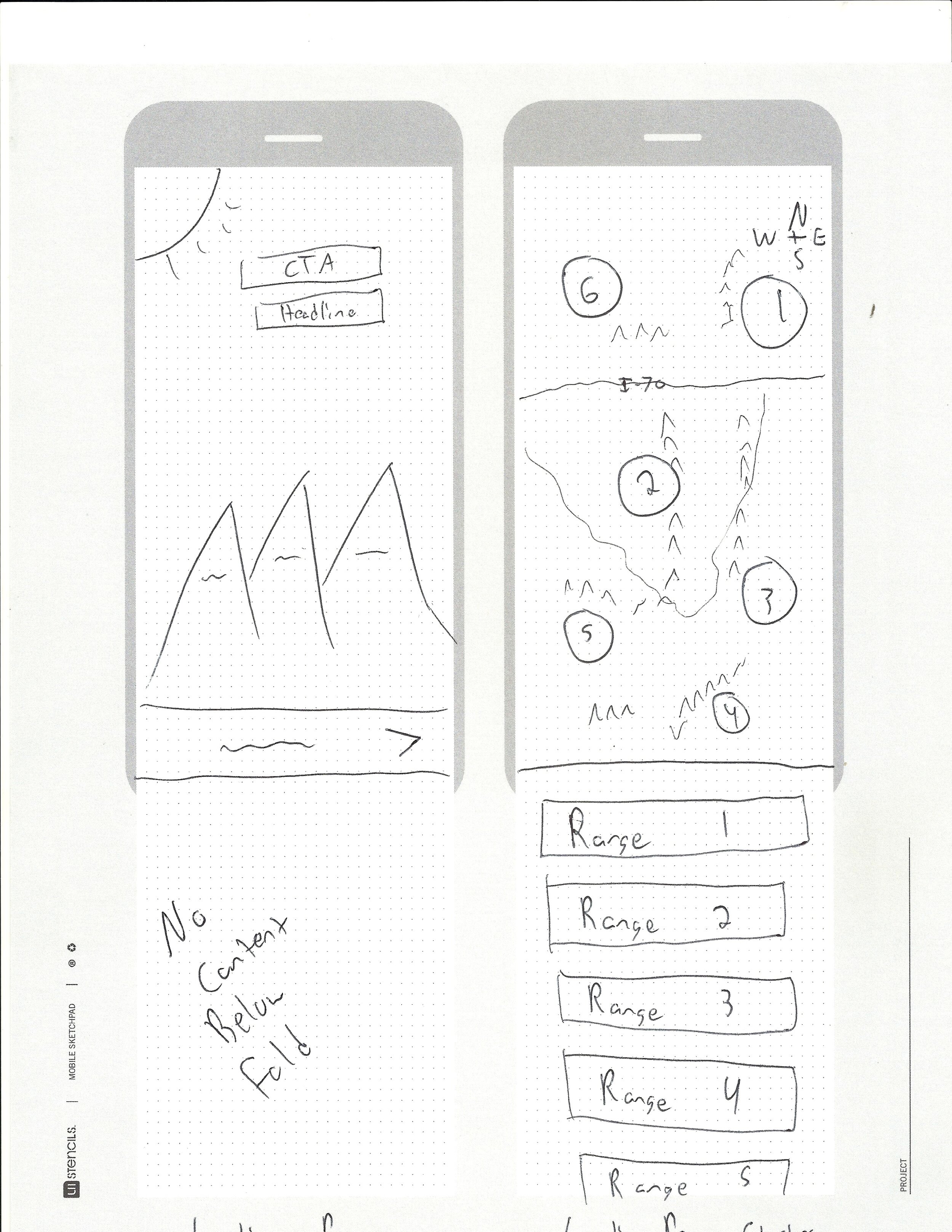
Sketching (a handful of the later stage concepts)


Mood Boards


Creation
Branding
After looking across the industry I found several key branding aspects that I wanted to include in this redesign. I developed a style sheet and two screen mockups to help guide future digital authoring.
The color palette needed to reflect both natural simplicity and the assurance of modern technological tools.
Icons should be fun but simplistic. Over stylization could lead to confusion.
Typography should invoke a sense of wonder-meant but remain easy to read.

Planning Flow
The newly designed planning flow would be the signature UX of this redesign. By utilizing a lower tab visual placement cue, users would understand what part of the panning journey they were on. The organization of content then suggested a happy path towards the next piece of information.

Final Screens


Reflections
Increased Technical Control
One limitation was that this project was a redesign of a current platform and not a blue sky product concept. In order to create the perfect tool for hikers additional engineering would be needed. I limited myself to only adding front end features as without this it would not be a redesign but a new product. Working with the creators of the current platform could yield greater flexibility.
Further User Testing
Further field user testing would be necessary before rolling out this redesign. With most use taking place outside the home, specific issues may arise.